Jack Davison
Experience
Portfolio
Blog
Categories
All
(5)
DT
(1)
ggplot2
(1)
leaflet
(2)
plotly
(2)
tidytuesday
(1)
tidyverse
(1)
visualisation
(1)
Blog
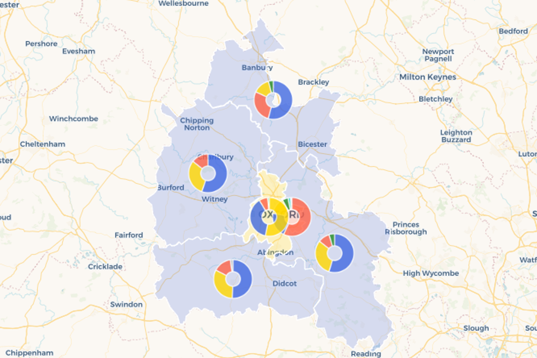
I ❤️ Leaflet: Using Plots as Markers
leaflet
Using (gg)plots as markers in leaflet maps in R.
Sep 26, 2023
Jack Davison
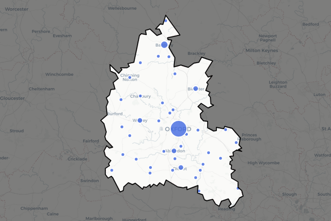
I ❤️ Leaflet: ‘Shading out’ regions
leaflet
Shading out the rest of the world (kind of!) to create regions of focus in a leaflet map.
Sep 16, 2023
Jack Davison
Are
{tidyverse}
function names getting longer?
tidyverse
plotly
Are we approaching sentence-length
{tidyverse}
functions?
quarto::read_blog_carefully_with_eyes()
to find out.
Mar 4, 2023
Jack Davison
Visualising Uncommon Factors
visualisation
ggplot2
plotly
DT
Avoiding incomprehensible legend items in your proportion charts through tabulating, lumping or interactive visualisations.
Feb 20, 2023
Jack Davison
An Ode to Data Tidying (TidyTuesday 2021 Week 6: HBCU Enrolment)
tidytuesday
A disucssion on data tidying and cleaning, with applications to a messy, unfamiliar data set.
Feb 2, 2021
Jack Davison
No matching items