This is a blog post in the “I love leaflet” series, where I share tips and tricks I’ve discovered over time working with the leaflet R package. You’re therefore best off loading leaflet before we get cracking!
Starting Off
I’m going to start by creating a map showing the Oxfordshire results of the 2019 UK General election. I’ve scraped the data from Wikipedia (for example, here’s Witney; if you’re interested in doing so yourself, do expand the box below to see the code. I’ve also obtained a map of constituencies from a public UK Government Data Portal.
library(rvest)
library(ggplot2)
library(dplyr)
scrape_tbl <- function(url, n, slice) {
read_html(stringr::str_glue("https://en.wikipedia.org/wiki/{url}_(UK_Parliament_constituency)")) |>
html_table() |>
_[[n]] |>
janitor::clean_names() |>
slice_head(n = slice) |>
mutate(
constituency = url, .before = everything(),
votes = readr::parse_number(as.character(votes)),
percent = readr::parse_number(as.character(percent))
)
}
tbl <-
bind_rows(
scrape_tbl("Banbury", 6, 4),
scrape_tbl("Henley", 3, 4),
scrape_tbl("Oxford_East", 3, 8),
scrape_tbl("Oxford_West_and_Abingdon", 3, 4),
scrape_tbl("Wantage", 3, 4),
scrape_tbl("Witney", 4, 3)
) |>
janitor::remove_constant() |>
select(constituency, party = party_2, candidate, votes, percent)# A tibble: 27 × 5
constituency party candidate votes percent
<chr> <chr> <chr> <dbl> <dbl>
1 Banbury Conservative Victoria Prentis 34148 54.3
2 Banbury Labour Suzette Watson 17335 27.6
3 Banbury Liberal Democrats Tim Bearder 8831 14
4 Banbury Green Ian Middleton 2607 4.1
5 Henley Conservative John Howell 32189 54.8
6 Henley Liberal Democrats Laura Coyle 18136 30.9
7 Henley Labour Zaid Marham 5698 9.7
8 Henley Green Jo Robb 2736 4.7
9 Oxford_East Labour Co-op Anneliese Dodds 28135 57
10 Oxford_East Conservative Louise Staite 10303 20.9
# ℹ 17 more rowsThe first thing I’m going to do is define a colour palette for the UK political parties. Our main two parties are the Conservatives (right-wing, blue) who currently form His Majesty’s Government, and Labour (left-wing, red) who are currently His Majesty’s Most Loyal Opposition. Or, in other words, the Tories are in charge and Labour are in second place (for now). We also have, in general order of popularity, the Lib Dems (liberals, yellow), the Greens (environmental, green), ‘Reform UK’/the Brexit Party (right-wing populist, turquoise), and a variety of independent candidates unaffiliated with national political parties (typically represented using grey).
I find the winner in each constituency, join it to the shape file, and create Figure 1.
# define colours
colours <-
dplyr::tribble(
~party, ~color,
"Conservative", "royalblue",
"Labour", "tomato",
"Labour Co-op", "tomato",
"Liberal Democrats", "gold",
"Green", "forestgreen",
"Brexit Party", "turquoise",
"Independent", "grey"
)
# put into handy vector
cols <- colours$color
names(cols) <- colours$party
# read results CSV
results <- readr::read_csv(path_to_results_csv)
# filter for winnings party for each constituency
winners <-
results |>
dplyr::filter(percent == max(percent), .by = constituency) |>
dplyr::mutate(constituency = snakecase::to_title_case(constituency))
# read constituency boundaries
constituencies <-
sf::read_sf(path_to_polygon_sf) |>
sf::st_transform(crs = 4326) |>
# join on winners
dplyr::left_join(winners, by = dplyr::join_by(PCON21NM == constituency)) |>
# drop all other constituencies
tidyr::drop_na(percent) |>
# join on colours
dplyr::left_join(colours, by = dplyr::join_by(party))
# make map
map <-
leaflet(constituencies) |>
addProviderTiles(providers$CartoDB.Voyager) |>
addPolygons(
color = "white",
fillColor = ~color,
weight = 1.5,
opacity = 1,
popup = ~PCON21NM
) |>
addLegend(
colors = cols[names(cols) != "Labour Co-op"],
labels = names(cols)[names(cols) != "Labour Co-op"],
title = "Party"
)
# preview map
mapNow, Figure 1 is a nice map, but we’ve lost a lot of data here. How big are the majorities? Who else did people vote for in each constituency? We could add all of this info to a popup, but then we can’t see all of it at once, and it may not be immediately obvious to incurious readers to click on the map in the first place. Instead, lets encode all of this extra data as plots and overlay them on the map.
Making the plots
In this post, we are going to make the dreaded pie chart! Figure 2 shows the pie charts we’ll overlay the map with. I’ve made these using ggplot2, with geom_col() drawing the actual shapes, coord_polar() wrapping them into a pie chart, expand_limits() adding the doughnut hole, and theme_void() removing all the extra fluff. We want something minimalist here - no axes or labels.
library(ggplot2)
results |>
dplyr::left_join(colours) |>
ggplot(aes(y = "", x = percent, fill = party)) +
geom_col(show.legend = F, color = "white") +
coord_polar() +
expand_limits(y = 0) +
scale_fill_manual(values = cols) +
theme_void() +
facet_wrap(vars(constituency))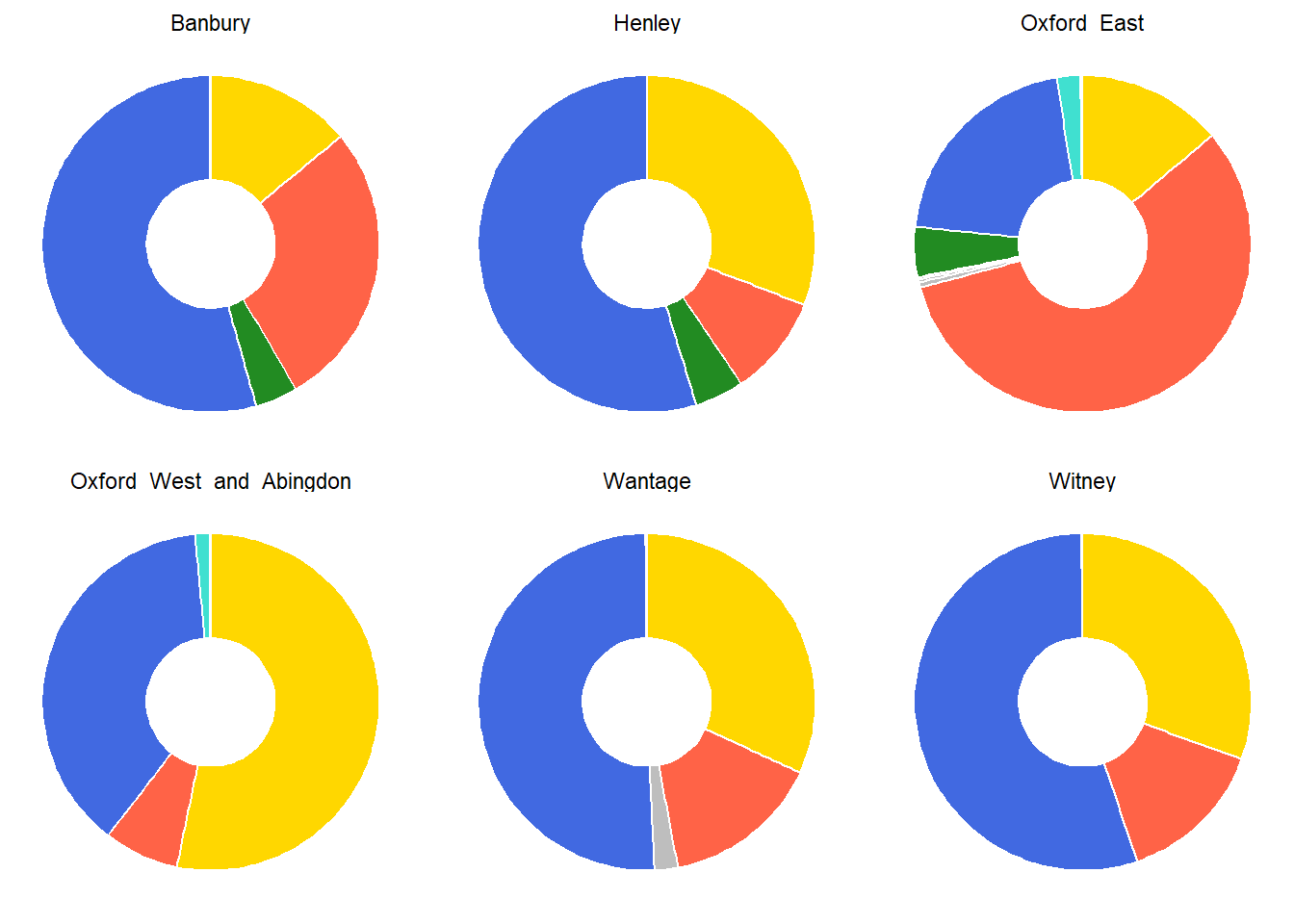
To use these plots as markers, they need to be individual images, not ggplot2 facets. To do this in a tidy way, I’m going to write a function which creates a pie chart and then apply it to nested data. This keeps everything neat and tidy, and will help us shortly when it comes to making the map!
make_pie_chart <- function(data) {
data |>
dplyr::mutate(party = forcats::fct_reorder(party, percent)) |>
ggplot(aes(y = "", x = percent, fill = party)) +
geom_col(show.legend = F, color = "white", size = 3) +
coord_polar() +
expand_limits(y = 0) +
scale_fill_manual(values = cols) +
theme_void()
}
results_plots <-
results |>
dplyr::left_join(colours) |>
dplyr::nest_by(constituency) |>
dplyr::mutate(plot = list(make_pie_chart(data)))
results_plots# A tibble: 6 × 3
# Rowwise: constituency
constituency data plot
<chr> <list<tibble[,5]>> <list>
1 Banbury [4 × 5] <gg>
2 Henley [4 × 5] <gg>
3 Oxford_East [8 × 5] <gg>
4 Oxford_West_and_Abingdon [4 × 5] <gg>
5 Wantage [4 × 5] <gg>
6 Witney [3 × 5] <gg> Placing markers
So we have our plots, but now we need to know where they’re going to go. The sf::st_centroids() function will help us find appropriate places for the markers. A “centroid” is literally just the geometric centre of any shape, so will do the job in this case.
addMarkers(map, data = sf::st_centroid(constituencies))A marker uses that blue tear-drop shape by default, but you can actually use any image as a marker. For example, we can point the makeIcon() function at the Wikipedia logo (chosen entirely arbitrarily) and suddenly we get Figure 4.
addMarkers(
map,
data = sf::st_centroid(constituencies),
icon = makeIcon(
iconUrl = "https://en.wikipedia.org/static/images/icons/wikipedia.png",
iconWidth = 50, iconHeight = 50, iconAnchorX = 25, iconAnchorY = 25
)
)So now we have an issue; our pie charts aren’t hosted on the web, nor are they even saved anywhere locally. How do we bridge this gap?
Using plots as markers
The way I’d do it (and the way we do it in openairmaps!) is to follow these steps:
Add a column to the plot data frame containing a unique file path for each plot. Point this towards a temporary directory to avoid polluting your work space.
Map over the two columns - plot and path - to save the plots to your system.
Join the paths onto the shape data you’re actually adding to the map (in this case, the constituency centroids).
Make your map, using the formula syntax (
~) withmakeIcon()to use the column of paths as the values given toiconUrl. You may have to play around withiconWidthandiconHeight- just ensureiconAnchorXandiconAnchorYare equal to half their values, as this will centre the plot.
This is a way I’ve found that ensures everything is kept wonderfully neat and tidy, and everything (space and plots) remains properly aligned. See the results of this in Figure 5.
# get a temporary directory
t <- tempdir()
# create file paths
results_plots <-
results_plots |>
dplyr::mutate(path = paste0(t, "/", snakecase::to_snake_case(constituency), ".png"))
results_plots# A tibble: 6 × 4
# Rowwise: constituency
constituency data plot path
<chr> <list<tibble[,5]>> <list> <chr>
1 Banbury [4 × 5] <gg> "C:\\Users\\Jack\\AppData\…
2 Henley [4 × 5] <gg> "C:\\Users\\Jack\\AppData\…
3 Oxford_East [8 × 5] <gg> "C:\\Users\\Jack\\AppData\…
4 Oxford_West_and_Abingdon [4 × 5] <gg> "C:\\Users\\Jack\\AppData\…
5 Wantage [4 × 5] <gg> "C:\\Users\\Jack\\AppData\…
6 Witney [3 × 5] <gg> "C:\\Users\\Jack\\AppData\…# save plots to the temp directory
purrr::walk2(
.x = results_plots$plot,
.y = results_plots$path,
.f = ~ ggsave(
filename = .y,
plot = .x,
width = 4,
height = 4,
dpi = 300
)
)
# combine the paths with the centroids data
centroids <-
sf::st_centroid(constituencies) |>
dplyr::left_join(
dplyr::transmute(
results_plots,
constituency = snakecase::to_title_case(constituency),
path = path
),
by = dplyr::join_by(PCON21NM == constituency)
)
# add the markers
addMarkers(
map,
data = centroids,
popup = ~PCON21NM,
icon = ~ makeIcon(
iconUrl = path,
iconWidth = 60,
iconHeight = 60,
iconAnchorX = 60 / 2,
iconAnchorY = 60 / 2
),
options = markerOptions(opacity = 4 / 5)
)Finishing Off
We can now usefully bring things together a bit and add some other neat leaflet functionality, like a layer control menu to turn on and off our different map features. You can see this in Figure 6. As this is our final map, I’ve popped it in a bslib card so you can make it full screen for a closer look.
bigmap <-
leaflet(constituencies) |>
addProviderTiles(providers$CartoDB.VoyagerNoLabels) |>
addProviderTiles(providers$CartoDB.VoyagerOnlyLabels, group = "Map Labels") |>
addPolygons(
color = "white",
fillColor = ~color,
weight = 1.5,
opacity = 1,
popup = ~PCON21NM,
group = "Contituency Boundaries"
) |>
addLegend(
colors = cols[names(cols) != "Labour Co-op"],
labels = names(cols)[names(cols) != "Labour Co-op"],
title = "Party"
) |>
addMarkers(
data = centroids,
popup = ~PCON21NM,
icon = ~ makeIcon(
iconUrl = path,
iconWidth = 60,
iconHeight = 60,
iconAnchorX = 60 / 2,
iconAnchorY = 60 / 2
),
options = markerOptions(opacity = 4 / 5),
group = "Pie Charts"
) |>
addLayersControl(
overlayGroups = c("Map Labels", "Contituency Boundaries", "Pie Charts"),
options = layersControlOptions(collapsed = FALSE)
)
bslib::card(bigmap, full_screen = TRUE, height = 500)